
What I’ve Learned About Print Disabilities
Guest article from VERONIIIICA.
Welcome to Print Disability Week, where I will be posting once a day about ways to receive services for a print disability, with a webinar on Thursday in collaboration with AIM-VA, an accessible educational materials provider for students with print disabilities in grades K-12 in Virginia. Today, I will be sharing things I wish I knew about having a print disability back when I was in high school, and things I have used.
I was at a doctor’s appointment this summer when my mom noticed that I kept confusing the letters B and D on the eye chart, as well as a few other letters. She asked me afterwards if those letters looked like they were the same to me when they were on their own, and I said yes. She then asked me if that’s why I always had issues with matching questions on tests, where the student writes a letter to match a word and a definition. Suddenly, it all made sense as to why I always seemed to miss questions that seemed so simple. While I could distinguish the letters B and D when they were in a word (since the brain doesn’t read every single letter), I had trouble distinguishing them on their own. My mom then jokingly told me I could have been valedictorian if we figured this out sooner, and I pointed out “it’s hard to be valedictorian if you don’t know the alphabet.”
Following this conversation, I started thinking about things I wish I would have known sooner about having a print disability, and tools that have helped me succeed in high school and college. Here are ten things I thought of, and how they help me.
Explaining what a print disability is
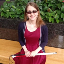
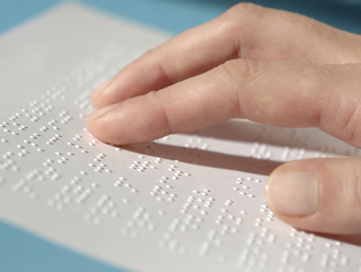
A print disability affects a person who cannot read normal materials because of a visual, learning, or other disability. I have low vision and cannot read anything smaller than size 24 point font, and have trouble with serif fonts such as Times New Roman. A great simulation to show someone how I see printed materials is to tell them to slant their eyelids with their fingers and look down. I also found that this YouTube video sums up what happens when someone hands me materials I cannot see, in a comedic way.
Portable CCTVs
How I wish I had one of these when I had to do chemistry worksheets, but this device has been fantastic in many of my college classes. Read my full review of the SmartLux here.
Use colorful language
No, this isn’t to say use swear words, but incorporating color into accessible materials has allowed me to really absorb more information. One thing that has really helped me in math is outlining letters and numbers in different colors- A is red, 2 is blue, C is green, 4 is purple, etc. This helps prevent me from confusing symbols and lets me easily see exponents and symbols that are traditionally smaller.
Colored backgrounds
I will have a full post about the use of colored backgrounds on Friday, since I actually did a science fair project on this my junior year of high school. It’s easier on the eyes to read things on a colored background as opposed to sharp white, since sharp white can cause glare. My backpack was nicknamed “bag of rainbows” because I used pink, blue, yellow, and purple colored papers for my schoolwork. It helped to reduce eye fatigue and I noticed I could read much faster than on bright white paper.
Larger paper for math, science, and music.
When it comes to math and science, it is very important not to cut off any symbols, since that can dramatically change the information presented. The same goes with music, where having one note cut off can throw off the entire piece. As a result, I receive my math and science work on 11 x 17 paper, with a colored background, and my music on the same sized paper, requesting the paper be either off white or yellow because I wear sunglasses while playing.
Textures
I am not a Braille reader, however I have found that tactile labels and textured markers have really helped me with processing information on a page. Typically, I layer washi tape on top of graphics to provide extra contrast. Another cool trick I learned is to trace white glue over lines or graphs so that way I can feel what is on the page without it being overly obvious. This is especially great when it comes to working with items on a number line.
Patterns
When working with digital materials, I assign different patterns on lines (zig zag, dashes, squiggle) and have them in different colors so I can see where they intersect and what type of lines they are. This has been especially useful in my database programming class while working with Microsoft Visio, where different ends of lines give important information and lots of lines are intersecting.
eReaders
I was one of the first people to buy the Barnes and Noble Nook when it came out when I was in seventh grade. It allowed me to read almost any book I could think of, all in glorious large print. It had a cellular data connection too, so I could download a book in thirty seconds, which was extremely helpful when the teacher would randomly assign us books to read. eReaders are so inexpensive now that it would be insane not to have one. Here is the model I use now.
eBooks
I love Bookshare, and will have a full post on it tomorrow about how much it has changed my life, but there are so many other services to read books for free. Here is a post I wrote about services at local libraries to help people with print disabilities. Using all of these tools, I have only ever encountered one book that I ever had to read in print in the last five years.
Another great resource is accessible instructional materials organizations. My state has AIM-VA, which will enlarge textbooks, classroom materials, and more for students with an IEP for print disabilities. I will have a post on them Thursday.
Digital formats for assignments
I have an entire post on why I prefer my schoolwork digitally, and it helps to make sure materials are in an accessible format before giving them to a student. I request that teachers give me materials in .doc, .docx, .ppt, .pptx, or if absolutely necessary, .png or .pdf. I find it easier to have editing capabilities so I can quickly fix materials if I find them difficult to see, but have rarely had any problems with .pdf or .png formats, as long as I can see them clearly.
To answer a common question, I do not mind having a print disability, and I don’t necessarily feel like I am “missing out on the world” because I have one. I have never been able to read small fonts, so I don’t know life any other way. With all of these technologies and different techniques, I am able to access materials just like my sighted friends, and read alongside them.